Wednesday 28 May 2008

render tests+lighting1

These pictures and video show experimentation with mayas render settings and lighting. the first picture his simply been lit with a variety of lights (2 area, 2 directional) to give the grey character some colour and basic shadow.


The image below is an occlusion render pass. This effect stresses the proximity of shapes to one another. By using occlusion areas of deep shadow (such as under the hat and under the characters feet) become much darker. It also has the bonus of creating a specled effect over the geometry as the dark areas dissappear and fade to white.
This video shows the two passes and a third (a shadow layer) all merged.


I hope to play around some more with lighting and render tests in the coming week as i animate my final pieces for Dave and Adam.

Wunderland Tank Tracks

Here are animated texture tank tracks! originally drawn in illustrator by Adam, I have animated the still image in Flash by converting parts of the image to symbols and distributing them across multiple layers. by Motion tweening the majority of the parts the animation has worked out incredibly smooth(despite the many pratfalls along the way trying to get it to work).

By using masks i have hidden large tread pin lines so you can only see the ones on the tank. unfortunately using motion paths did not work in tandem with the masking so one method or the other had to be used. Masking was faster and gave good results where the motion path required every individual tread pin to be guided by hand. This was not going to be time efficient given the looming deadline so masking was chosen.

The tank tracks, tread-pins, wheel highlights and wheels have all been animated.


Tuesday 27 May 2008

ThePoet - Ha

These blasts were intended to be used in the sequence with the laughing ducks. The tests include variations of the phrase 'Ha!' and how it would explode onto the screen. These have been fazed out by the same decision to faze out the text in favour of simple icons and symbols.


Flower Cycles for the Poet

Here is all the flower cycles created for The Poet.


Wunderland update


Here is a blast of the small yellow robot leader marching to a halt, avoiding a missle and preparing to disassemble.

Poet Changes+ Wunderland progress

The Poet

The Poet film has changed dramatically. No longer will dave be using 2d words for his characters as the final look has become messy. Instead he s going to use animated symbols - still from the font i designed but this way the screen isnt cluttered. Less is more.

The ice cream test shown here was a basic test to try and show a ball of ice cream hitting and sliding down a target. the final product however needs only to be the splat now so this willbe far easier to animate.


War in Wunderland

I have been given the task of animating the tank tracks in flash for Red's Wunderland tank. This will require me to use several technical aspects of the flash program to complete the task the way Adam wants me to. I have to use a mask to complete the track itself, a motion path for the track teeth and timed movie clips for the wheels inside the track.

This is an incredibly helpful assignment as i feel that my technical folder is severely lacking and although i have done effects and text blasts for dave in post, i feel more is needed. This task will help bolster this folder. Once this task is completed i will return to Bigbot and animate him throwing cars of a bridge.

Tuesday 20 May 2008


here's the final cut of the quack animation.

Muse Update 2

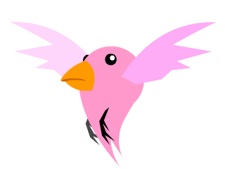
Over the last few weeks i have been very busy with the 2D title sequence which involves one fully animated sequence duplicated at various points to create a full fly cycle. This cycle was so well recieved that another was created (in pink rather than blue) to compliment it.

the basic blast is below (minus the duplications which were finished for the final edit in after effects).


Here is an example of the bird colour scheme in pink: -

All the main edits of the lettering animation are unavailable for blogging as Dave wants to keep the final cuts under wraps until the final film is complete. There have been a few changes to the original tests i did. They are as follows: -

The quack? sequence was rescaled to fit the HD cut with little or minimal changes made to size and scale of the letters.

The Waa sequence was completely redone however.The text had to be rescaled, moved into a diagonal tangent and positioned so that the word fit across the screen but more artistically than before. We used drop shadow to crate a letter shadow across the character but applied a mask so it only cast shadow across the area of the character it passed rather than the whole scene. All the 'A's in the WAA had to be redesigned and reversed so that the brown 3d depth was cast in the opposite direction. once this was completed we created a dissolve effect using coloured fractal noise to make the word disappear near the end of the scene.

The second waa scene was animated directly onto the final cut of the film and featured multiple A's flooding out of the poets mouth onto his book and beyond. Having completed this scene we realised to keep the continuity of the film the previous scene (described in length above) needed to be reworked to accomodate the new speed of the text. d'oh!

As mentioned before these cuts are unavailable for blogging as Dave wants to keep the content censored until the film is complete.

Muse update


By using PNG files instead of Jpegs we can utilise a better quality picture and avoid using the green screening and green highlights. Now all the pictures feature the background alpha'ed out so it saves time to create the test sequences and it looks crisper. Here is an example A (other letters are all very much the same) and a string of random symbols to prepresent profanity.

Today i have completed several tests using these letters. The first wave of tests included Quack?,Nooo, Wait and Waa. Each sequence's letters move and react differently depending on the situation. The second wave will be updated later on this week.


Tuesday 6 May 2008

Letter styles


The final colours for the 2D letters are yellow and brown - matching the title sequence. The video below shows an early test for letter decoration using fan-flowers.


The Poet Update

Here are the recent updated works for David Bate's The poet. Letter tests will be updated later.

Below are the pencil concepts for the 2D dickie birds.


Once Dave had chosen his preffered design i completed the colour concept sheets complete with alternate feathers, colours, beaks and styles.


The flight test shows the bird in action! the birds are designed to be fluid - like tear drops gliding down a cheek - so their bodies move more like droplets of water than real birds. The image above the test shows how the video was constructed - using parented objects and flexible skelton guides.