
 The penicls outline the characters for the digital inkwork. I have not coloured the piece yet as I am uncertain if Ash has finalised his colour scheme.
The penicls outline the characters for the digital inkwork. I have not coloured the piece yet as I am uncertain if Ash has finalised his colour scheme.
The penicls outline the characters for the digital inkwork. I have not coloured the piece yet as I am uncertain if Ash has finalised his colour scheme.


 These dragon designs can be found on the buildings, windows, lanterns and fences I designed. The two black dragons (done in Flash) were the 2 I favoured and used in the final concept designs.
Lanterns


 Blue lanterns are not used in festivals but I coloured one anyway as I had an idea prehaps the reason the odd house out was blue because its lanterns cast blue light. This could be because the lantern itself is blue, because the lantern has a mystical blue flame or prehaps it is not even lit (so in the dark the clour would seem blue/purple/grey rather than red/orange and gold).
Building Bits (like lego but less fun)
The designs below are the elements I used to create my building concepts. These pieces can be scaled up, down, out or in to create larger or smaller versions of the same thing. The idea was to create a basic idea of what the buildings would look like so the designs are all relatively simple.
The first set of pieces are the doors, windows and fences used to decorate the blank wall templates. The next pieces are the various roofs. Some elements are more ornate than others.


Buildings


 I think these are all very different from one another and give a good range of different building designs. Structure design is not a strong point of mine, I am more involved in character design, so I hope these are what Jessica wanted or sort of imagined when she asked for building concept.


 Here are the expression sheets. I went for basic expressions to begin with so that the favoured ones could be chosen and any more exaggerated or obsure ones could be drawn up if they were missing. At one point the monkeys talk so when the sound comes in for that segment I will draft out the lip sync mouths. Here is Red, Robot and Secret Agent Monkey.

 As I mentioned before there isn't an awful lot going in the main groups i'm working for at the moment so I may have to branch out and steal some work off of the other groups in order to keep busy next week.


The morning board focuses on daylight colours: blue, orange, green.
The sunset board focuses on warmer colours: pinks, reds, oranges and yellows.
The night time board focuses on cool colours: blues, purples, greys and tans.
War in Wunderland
As I mentioned in my opening paragraphs, this week I coloured some of my storyboards from last week for Adam's War in Wunderland project. We sat down as a group of three (including Caspar) and picked out all the storyboards we thought would demonstrate the widest variety of colour in different circumstances. We chose a few from the opening scene which are quite drab and dark then a few from the fight sequence which are rife with colour and then some from the climax of the film which are set underwater. From roughly 77 storyboards we chose 9 pictures to colour - and here they are :-
 This opening board was chosen to show how boring and grey the office is. I added bloodshot eyes to show monkey may have been working here for hours on end without breaks. THis is a pretty bleak and mundane colour scheme. Money stands out very well here so we (the audience) instantly recognise him and what he is doing.
This board was chosen to show monkey in a darker colour scheme for when he enters the alley and meets secret agent monkey. All the colours here are closer to black than white in the digital colour spectrum.
 This board was chosen to show allthe robots massing together in the streets. Unfortunately there have not been many designs fo rhte robots 'OKed' at this time so I stuck to the yellow and brown colour palette of the original robot design and created a colour silhouette of the raging mob in darker versions of those colours. I made all the eyes 'glow' red to make the robots more ferocious and I also coloured the sky red to dramatise and emulate their war-walk.

Here we have the opposite. All the monkeys/space monkeys are busting onto the scene in their tanks, lorries, helicopters and jeeps. The sky here is a more natural blue in contrast to the previous board.
 This board shows the tank shell exploding behind the majority of the robot army.
 Here we have the Wunderland naval octopus whisking the robot off of the bridge. This board is useful because it has the octopus' colour scheme in light and dark due to perspective and distance in relation to the camera postition.

This board has two versions. We chose this to get an idea of what the sea would look like underwater as the robot was dragged down to his doom. The first board has the robot in his true colours (yellows etc) and the second has him in blues. The reasoning behind hte second one was i wanted to show that as light does not penetrate particularly deep in the ocean, the robot may look more blue or green the further he went down.
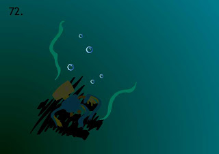
This is a follow up board to the previous two. The robot is so far gone his eyes have turned off and he is barely visible. The octopus, previously a silhouette, has now completely been obscured by the lack of light.
 This final board is from the end sequence where secret agent monkey looks on at a victory for monkeys everywhere before he leaves to the next mission in his banana-copter. i wanted to do a sunset skyline so the helicopter could fly off into the sunset for the ending but Adam said he had never planned to animate the helicopter taking off and leaving, only the monkey walking towards it. This picture was based on a couple of boards I accidentally left out of the blog last week so here they are: -

That's pretty much the workload form this week! The only piece of work I offered to do for Ash was a perspective drawing. I have not had time to do this so I plan on completing that this monday.